Planet Labs and the Task at Hand
National Geographic is a company that creates many things, one being their iconic magazines full of nature, science and technology. Planet Labs is a company that takes photos of the Earth from space. The goal of this challenge is to render an impossible to capture photograph, with 3D models. Planet Lab’s satellite cameras are going to be on a magazine cover, and the technology is difficult to explain to people with a single image. Meaning the goal for this task is to make a symbolic representation of what Planet Lab’s satellite does, and render it into a 3D model, to be used as a magazine cover, that I will also design myself.
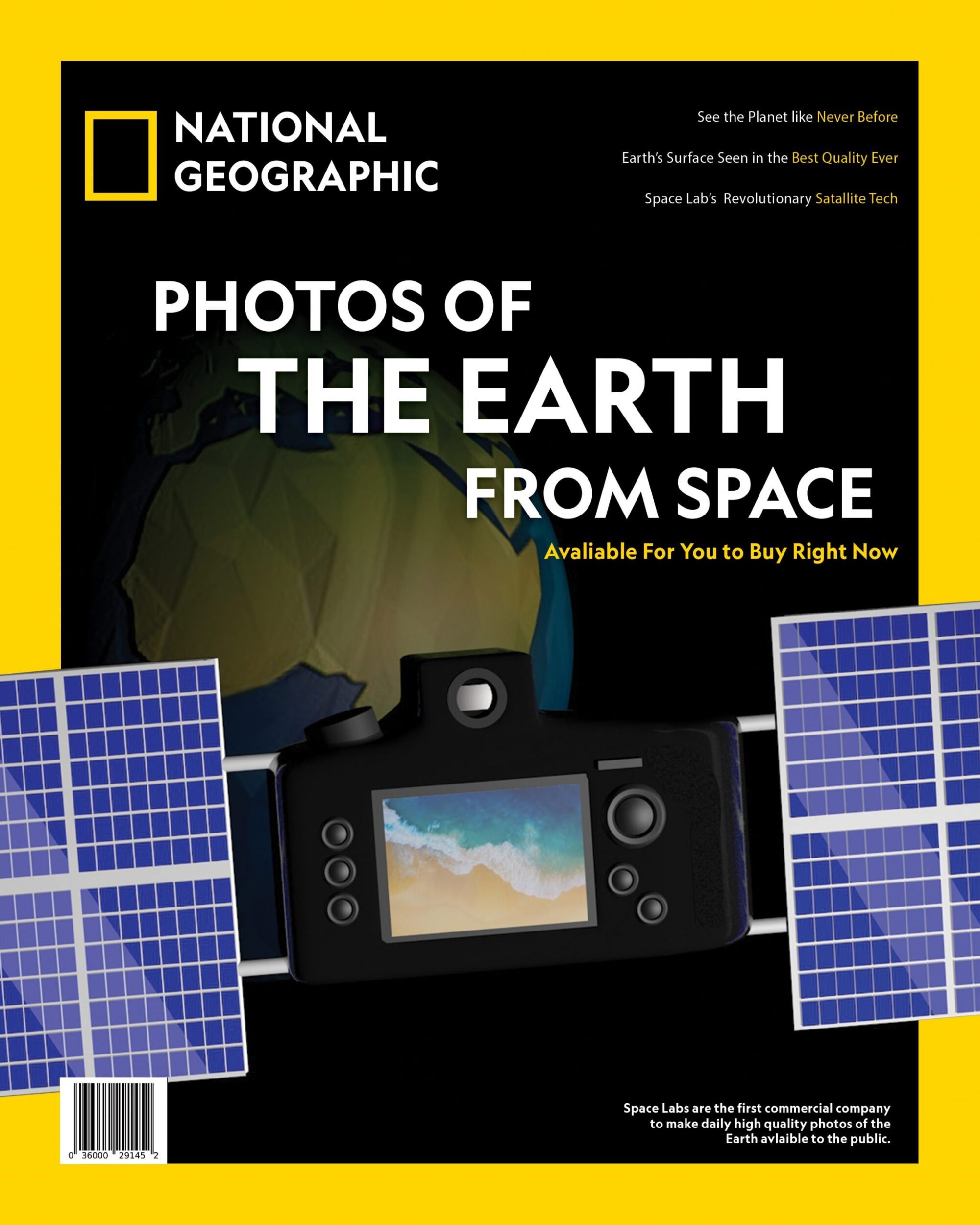
How Completing the Render was Done


I started the task by making low fidelity sketches of what the National Geographic cover could look like. Above, we have a few sketches of the first few ideas. After a group discussion on the most interesting and unique idea, the middle sketch was selected based on group interest. After the sketching was done, prototypes of the camera were designed in Cinema 4D.

Here we have a basic framework of the camera. A general shape was sculpted, with some basic details of the camera added, like a few buttons and the general shape of the edge of the screen.

After the camera received some more details, solar panels were constructed, duplicated and attached onto the improved camera design. Here we have a zoomed out wireframe of the updated design.

After the general build of the camera was finished. Color and lighting were added with various textures as well as the Earth behind the camera. It is a round ball with a low poly earth texture applied to it with a bump-map. The camera was made shiny to not blend in too much with the space background, and lighting helped make the whole solar panel design come together with more unity. They look much more dynamic and duplicated with the lighting going from one set of panels to the next.
Typeface
The typeface was a very simple task in the design. National Geographic has their own personal font called “Geographic” which comes in a few different variations for line thickness and italicized words. I used the official Nat Geo font for the entire cover, and used different levels of line thickness based on how important the words are. For example the title is very thick, but less important, shorter sentences are closer to the default size, since they do not need emphasis.
National Geographic’s Color Palette
The color palette of the magazine was a very simple one to do, with just a little basic color theory. The color palette of National Geographic is set as a rich distinct yellow color, and my render would include the black void of space as well as the Earth, which is blue and green. Yellow, blue and green is already an excellent analogous color palette. To simply match this without ruining it, the camera was made to be black and white, with only blues and yellows being additive to the camera satellite render.
